Hi there!
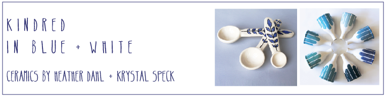
It's Heather here with a little up-date and sneak peek at what I unloaded out of the kiln today! Lots of pretty blues in all sorts of patterns! I was playing around with the sizes of patterns and shades of blue this past firing- for the most part I'm really pleased with what I took out of the kiln! I ended up doing a bit of 'blind' glazing this last time around as I have been working with a new porcelain that is beautiful, white and translucent, however the glazes tend to be quite fuzzy where they meet the white glaze. In spots it can look really nice, but occasionally I feel like it messes with the patterns a bit, so I'm going to have to watch out for how thick I apply the glazes the next time around. I also was hoping to expand my deep blue glazes, but am still working towards this. I have quite a few pale and mid-range tones, but only the one deep indigo. Hopefully this will change by the time I ship off the work!!
In other news, I up-dated my current
website today to include a
new video that has been in the works for the past little while. One of my goals this year was to create a video of my hands at work in the studio. I felt it was a good time to open up about how my work is made and just some of the steps taken to create the work I make. I have a process that I have spent a few years developing to glaze and it's a method that really informs my work in a strong way. Please take a moment to watch the video to catch a glimpse of my low-tech, time-intensive method of glazing. It will make sense then why I'm so inspired by paper-cutting, quilts stripes and graphic, bold patterns reminiscent of textile prints.


 There are all sorts little bits from around my home and garden that have me embracing this blue phase. The little russian teacup, an ink bottle, rick rack trim, sun prints, watercolour swatches, washi tape, not to mention all the little blue flowers blooming in my yard right now. The photograph is one I found from our 4 month stint in Spain 11 years ago. Blue tile under a balcony with french blue windows. I love all the patterns- both simple and ornate, that blue and white makes. It just feels as though it's a colour for me to embrace in my work right now.
